Interpreting the Model Visualization
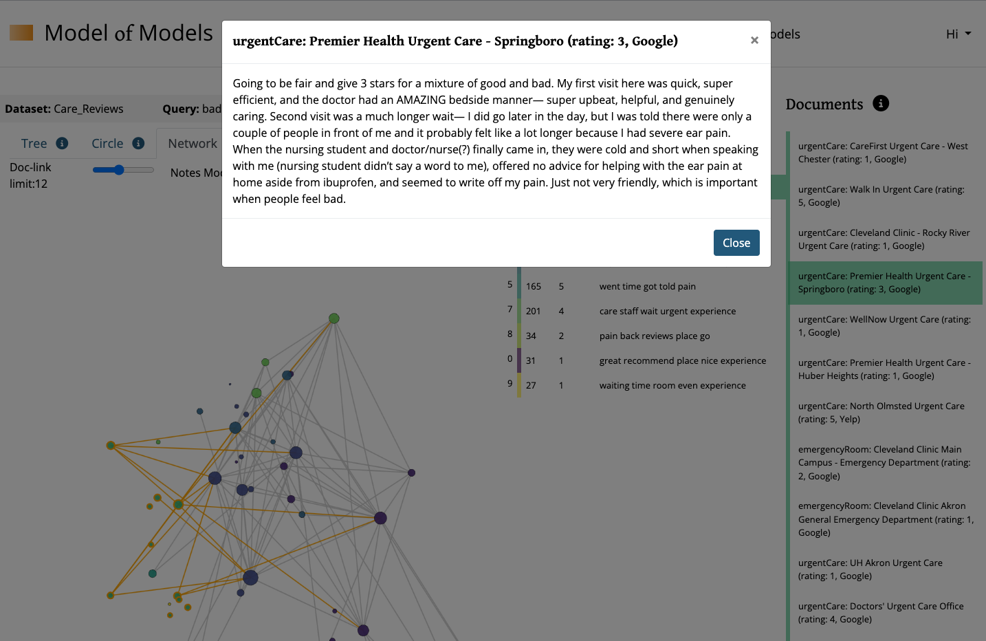
After building a model using the query and parameter setting, the platform’s Multi Level Model of Models option will generate a model and create three visualizations around that same base model. The default view will display the Network Visualization on the left side of the page, with the Topic-Cluster Chart to its right. Interacting with either of these two elements, will activate the third Document-Viewer element on the far right.
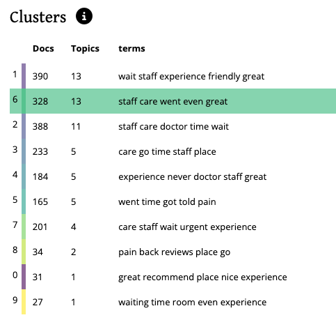
The Topic-Cluster Chart columns include the Topic-Cluster ID (this is a label only and does not denote meaning), Docs (the number of documents from the dataset that relate to that topic-cluster), Topics (the number of topics form that topic-cluster), Terms (the top 5 terms from that topic-cluster)
The Document-Viewer is populated by interacting with either a topic-cluster (from the topic-cluster chart element) OR the individual topic (from the nodes in the visualization element).
While the Topic-Cluster Chart and the Document Viewer will remain in place, you can toggle the different visualization options by clicking the tabs on top of the Visualization element labeled Tree, Circle, or Network.
BEFORE VISUALIZATION INTERACTIONS
Before beginning deeper analysis, it is helpful to click the “Topics” heading in the topic-cluster chart. This will sort your topic-clusters by the number of documents associated with it. This serves as a proxy for a topic-cluster’s relative weight in the model. Once sorted, spend some time looking through the top words in each topic-cluster beginning with the weightiest.
-
Are there any surprising terms or surprising terms co-occurring?
- Try clicking into the topic-cluster to populate the document-viewer and see where the surprising term shows up in context.
- Note: These documents are listed in order of their correlation to the selected topic-cluster or topic.
-
Are there words that occur in (almost) every topic-cluster?
- Before considering these to be stop-words, notice the topic-clusters where they are absent and consider what their absence/presence might reveal.
-
Is there a topic-cluster (or two) that contain largely ‘normal’ or even boring terms?
- This will vary depending on your corpus, but often a model will pick up on the endemic or structural language of a dataset.
-
Is there a topic-cluster with relatively lower probability scores even among that topic-cluster’s top documents?
- If a topic or topic-cluster has low scoring documents, but still a high number of documents, this might signal an area that is a common sub-topic. Think “supporting actor” who’s in everything.
NETWORK VISUALIZATION
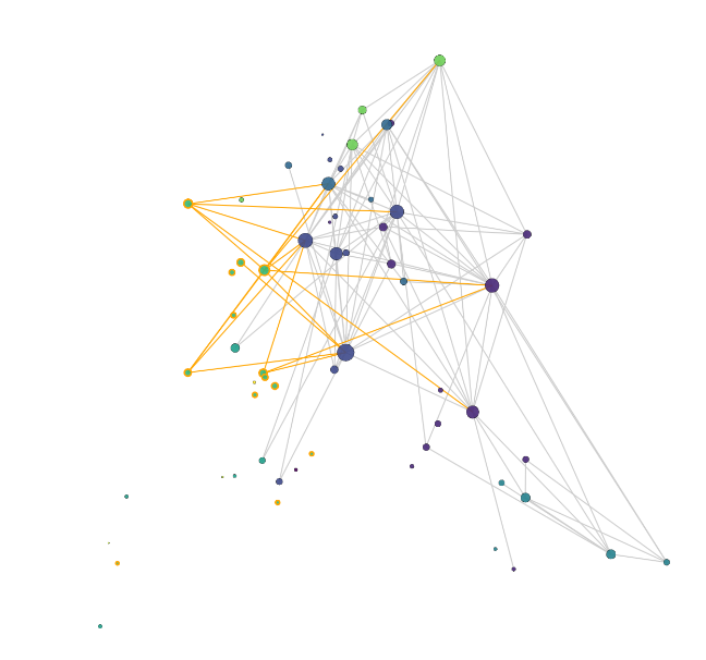
In the Network Visualization, each node represents one topic within the model. The size of these nodes depicts that topic’s relative prominence in the model. The color of each node represents that topic’s parent topic-cluster. You can also scroll over a topic-node to see the parent topic-cluster as well as the top terms of the individual topic.
Begin by clicking through each topic-cluster in the topic-cluster chart and see what space in the network that topic-cluster inhabits.
- Is the topic-cluster spread out or does it cluster its topics more tightly?
- What are each topic-cluster’s nearest neighbors?
- Are there clear ‘neighborhoods’ in the network?
Once familiarized with the network's areas and topic locations, add additional complexity to the visualization by interacting with the network visualization’s Doc-link Limit Slider tool. This tool controls edges forming between topic nodes. In the network visualization of the topic model, edges depict shared documents between individual topic nodes. Moving the Doc-Link Limit slider down, to the left will lower the threshold of documents required to form an edge. In other words, if you set the slider to 100, edges will appear between topics that co-occur in 100 (or more) documents. Setting the slider to a lower number, will then show more (weaker) edges. You can manipulate this slider through dragging it, or with the arrow keys on your keyboard. Adjust this down little by little to see what edges appear and at what threshold, while keeping in mind what you’ve learned about the network’s characteristics so far.
- What edges appear at the highest threshold (the “first” or “strongest” edges)?
- Which neighborhoods in the network are strongly connected to each other?
- Which neighborhoods in the network are relatively disconnected from each other?
- Are there any “island” neighborhoods in the network?Which edges appear that connect across the widest span of the network?
- Is there one, a few, or many edges connecting topic-clusters? Network neighborhoods? I.e., Do these connections rely on a single edge or is that responsibility dispersed?
- Is there one particular topic node, or a few, connecting multiple topic-clusters? Network neighborhoods?
CIRCLE VISUALIZATION
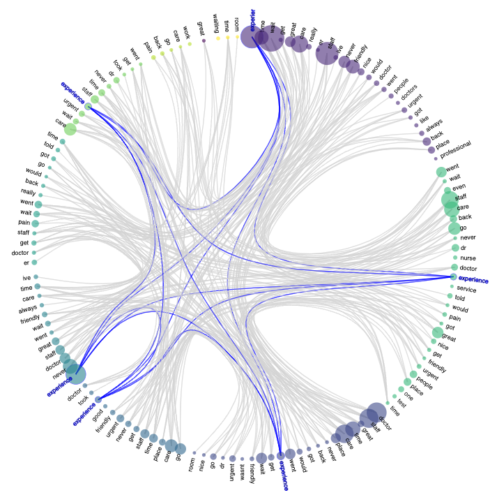
This Circle Visualization depicts the top words of topic-clusters and the other topic-clusters that share that word among their top words. This relationship is depicted by blue lines. Word circle size represents the number of occurrences of that word in the cluster's topic's top words.
Words in this circle all have high levels of dataset occurrence. However using this circle visualization you can better see which words form the strongest vocabulary in your network.
Conversely, and perhaps more interestingly, this also allows for an easier view of words that, while having a high occurrence in a given topic-cluster, are not as strongly present across the model as a whole. In other words, if you find a word in the circle visualization that does not have a lot of blue lines connecting across clusters, this word is then more specific to that topic-cluster. This specificity is helpful in understanding the topic-cluster’s more individual character. It is also helpful to make distinctions between topic-clusters that appear to be closely related to each other.
TREE VISUALIZATION
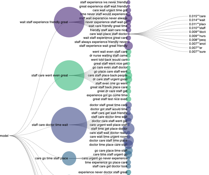
The last tab option is the TREE visualization. This depicts the hierarchical relationship between the topics (smaller nodes on the right side of the visualization), and their parent topic-clusters (larger nodes on the left side of the visualization).